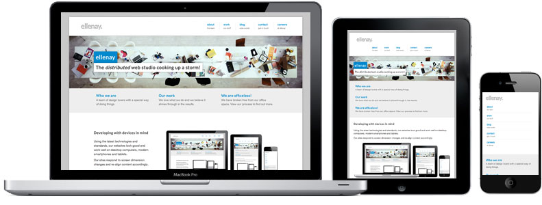
Developing for devices first
Using the latest technologies and standards, our websites look good and work well on desktop computers, modern smartphones and tablets.
Our sites respond to screen dimension changes and re-align content accordingly.


Using the latest technologies and standards, our websites look good and work well on desktop computers, modern smartphones and tablets.
Our sites respond to screen dimension changes and re-align content accordingly.


We only use the best archetecture to power our apps and websites. From the beginning, we plan to scale for events such as high volumes of traffic and large storage demands. 'If you build it, they will come' - and we make sure you will be ready!

CSS3 is the latest version of the language for web presentation. It supports custom fonts and complex designs. Web pages not only look good, but can now dynamically adapt to different screen sizes.

HTML5 is the latest standard for building web documents. The standard provides a rich media experience and seamless support for desktop, mobile and tablet devices.


